 Hi again.
Confession; I RARELY find a book cover I am so enamoured with that it sways me to buy a book without reading the first page or two, or at the very least, 2-3 reviews (hence why reviews are so important). Having said that, it would be a lie to say book covers do not sway the buyer, me included.
Sadly, they often sway me the WRONG way. Here are a few things that make me roll my eyes or simply skip completely.
- I can’t read the title – Now I’m not talking about the small print on Amazon, I’m talking about when I open the damn thing on my Kindle and someone has convinced the Author to go with some crazy font that
- Either my Kindle can’t read
- My eyes can’t take
- both
- Overly busy covers – Again, there is a time, place, genre, for busy, but honestly if I’m doing a book cover version of ‘Where’s
 Wally’ then I’m unlikely to want to read the book because
- I’m already over the cover
- Subliminally I am already thinking the novel will reflect the cover and I’ll be pulled in 100 directions looking for the point.
- Too bold and bright – Again, there is nothing wrong with bold and bright, but it must be done with some reference to the novel inside and the cover needs to allow my eyes to ‘rest’ a little too. Personally (and this is entirely personal) I am not fond of covers with too much orange or sunbeam yellow, I find those colours, when they dominate, to make me feel hot and sticky. Again personal preference, other people will love this but
- If your novel is not set in a hot & sticky setting, Summer time island setting, India during the monsoon period, as examples, that’s the impression it gives, even if people don’t know it
- And/or if your theme is not hot and sticky, think steamy erotic scenes, then the cover will not match either
- If you are going for a complete contrast to the theme and setting with your cover, more power to you, but you need to keep in mind that some people (like me) will skim right past this cover (unless it has been recommended)
- Really stupid marketing ploys – Sometimes a little knowledge is a dangerous thing, especially if you have assess to some
 illustration software and a desire to show ‘how creative’ you are. Not that long ago I read about a novel that had come out. I’d love to give you the title but, in the wisdom of the author and their publisher or agent or some intern in the marketing department, the novel HAS NO WRITTEN TITLE! I kid you not. Instead, there is an image of a group of people, their backs turned away, in a field in the evening looking at the stars. I think one is pointing but I could be making that bit up. The idea is that the ‘picture tells the story’ as in it’s called “Look Up” or something like that. Yes, it was a clever idea while on the promo cycle – I will grant you that, but what then? Someone is surfing the pages of Amazon or Smashwords (or wherever it is found – I have never checked) and there’s no title – Silly much? I can’t recall if the Author’s name is on the cover either.
And then there are all the truly jaw-droopingly obvious bits of advice I have read for improving/picking your cover-design. Comments like:
- Obtain Good Images (no! REALLY? Who knew?)
- Consider your format
- Use your imagination
 I could go on but honestly, why do people bother spending time writing this stuff, obtain good images… good grief! As far as images are concerned, yes OBVIOUSLY obtain good images, but more importantly, obtain images you are legally entitled to use. FYI, just because it’s on the net does not mean it’s free to use.
So, you may have noticed I’m a little bit ‘NARKY’ on this topic and that’s because everyone’s an expert. Truth is, it’s YOUR book, if you are with an agent or publisher, or if you’re doing this on your own, if you REALLY dislike your cover, stand up and say so. This is your career and this novel is a representation of you.
Here are my tips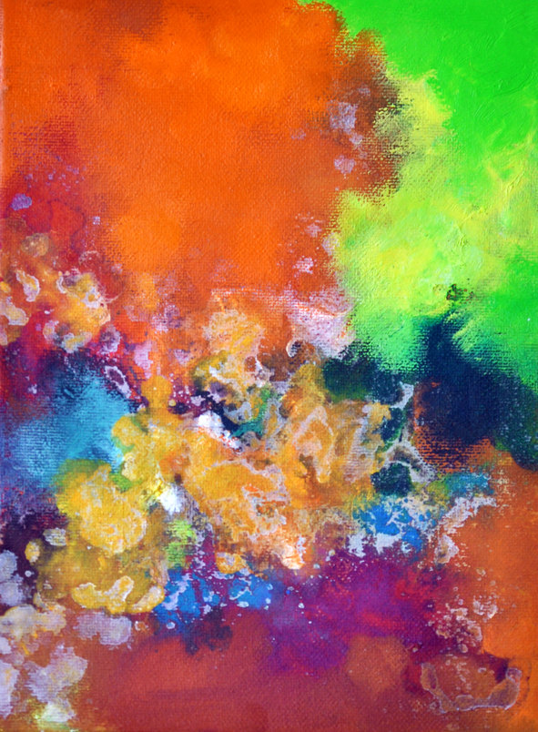
- Take your Writers Cap off and put your Readers Cap on. Look at the piles of novels you have around the house and those on your Kindle, and divide them by which covers most drew you in. Don’t think about age category or genre, think only COVER DESIGN. The reason for this is whatever you are drawn to is also a reflection of who you are and will likely help you discover how you want your cover represented. What you want is colour, imagery, design rather than girl-kissing-boy-love-story. Do you like the colours muted or bold and bright? Do you prefer the image to exactly reflect your novel or be a little mysterious – that sort of thing.
- Now make a list of your favourite book covers and
- Either find out who the illustrator/artist is or
- Give it to potential illustrators/your agent/your publisher as a guide of what you like.
- Write ½ a dozen 6-12 word pitches (that’s it no more) for your novel. This will help you clarify what your message/theme is as well as your audience. It’s a lot easier to create a cover when you know the theme in a few words and the audience it’s aimed at.
- Avoid the obvious – in other words, picture clichés. There is nothing wrong with turning a cliché on its head, that’s called clever marketing, but if it isn’t done well, the cover becomes a dud.
- Avoid too many images. Again, this is not a set-in-stone rule, in fact none of these are, it’s art and can be whatever you want it to be, but, busy images can confuse the potential reader.
- Look into colours & mood – seriously. This is not some ‘new-age’ mumbo jumbo, there are scientific studies to show that specific colours and tones within that colour palate, evoke different feelings and emotions.
- Go to a book store, the library, Amazon, Smashwords, Goodreads and do a search on your category and genre and see what covers are out there, and see which ones do it for you – add them to your list.
- If on doubt, throw it out. This is the hardest one. You may have an artist friend doing you a favour, perhaps for free or next to nothing, but you really don’t like the cover. It’s not going to be easy to say it’s not working for you but it’ll be a lot easier to do before the thing gets printed and you hate it and resent your friend a little too. Or you may have an agent, or publisher, or both, who have got their team of artists and illustrators… and they DO KNOW what they are doing. You should listen. You should try to learn. You should be prepared to compromise, however if you feel so strongly about the cover that is bothers you a day or two later, speak up before any more time or money is spent. Once it’s out, fixing the cover is not so simple.
- Don’t skimp on design. Yes it’s not cheap, especially if you are going the SP route, but, just as a good editor and proof reader is vital to your novel inside, a good, professional cover is to the front. It doesn’t have to have an image of the cosmos that was taken on a space-station, but it does have to have a clear image with decent pixels that conforms to industry standards.
 Lastly, I’ll refer you to Writer Digest (which for those of you who follow me know I think are a very useful author resource):
They have 10-tips.
Many of them are the same as mine. I in fact read theirs after I had read mine and it’s interesting that we cover pretty much the same points. If you don’t believe me, believe them 🙂
